The Psychology Behind IKEA’s Store Design And Why It Works So Brilliantly
The entire concept behind the strategy (read: psychology) is centred on encouraging people to stay longer in the store and persuading them to make a purchase. Imagine this: you walk into your favourite IKEA store planning to buy a single lamp, and three hours later, you emerge with a cart full of vases, throw blankets, and Swedish meatballs. Ah yes, that lamp too. That’s not a coincidence. It is the result of carefully engineered psychology at play.
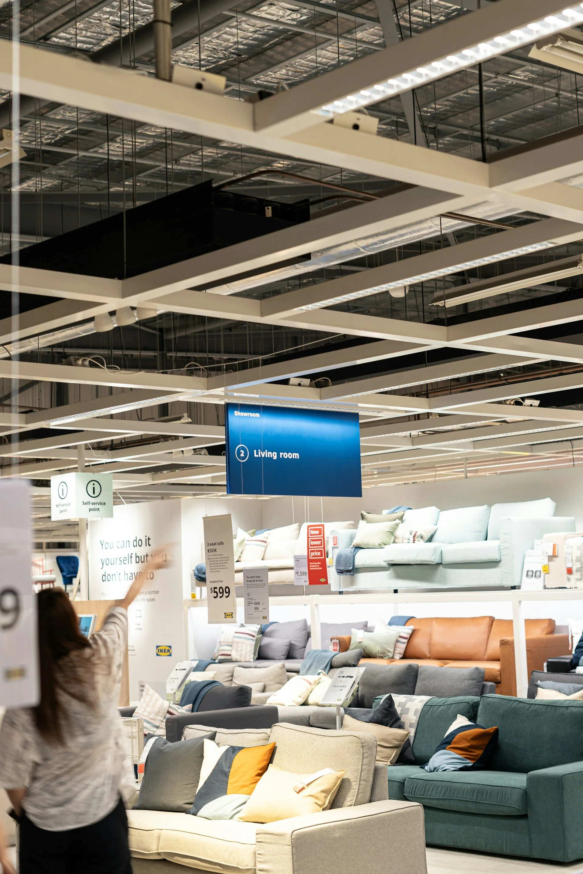
Instead of letting customers wander freely, IKEA guides them along a one-way path, called the long natural way. This deliberate design leads shoppers past every possible vignette, from bedrooms to kitchens to study corners. The effect is simple but powerful: exposure. The more you see, the more you imagine possibilities for your own home. That’s the psychological weapon right there.
But IKEA doesn’t stop at inspiration. After showcasing the dream spaces, the store gently shifts gears into the marketplace and warehouse sections. This is where browsing turns into buying. The marketplace is stocked with smaller, ready-to-grab items, while the warehouse holds the big-ticket flat-packed furniture. The transition changes the shopper’s mindset from imagining to acting, from ideas to tangible purchases.
Another genius move lies in the room settings themselves. These aren’t sterile displays. They are designed to look lived in, complete with blankets, lamps, and even the occasional coffee cup. It triggers imagination. Shoppers don’t just see a chair. They see their future living room. This subtle leap, from product to lifestyle, is one of IKEA’s greatest strengths.
Then comes what they call the endowment effect. The moment you pick up an item or drop it into your cart, it begins to feel like yours. Parting with it becomes psychologically difficult. Combine this with the sunk cost of travelling to IKEA, spending time walking its vast aisles, and even grabbing a meal in between, and most people will walk out with something, even if it wasn’t on their original list.
There’s also a clever manipulation of time. Most IKEA stores are designed without windows along the shopping route. Without natural light as a reference, customers lose track of whether it is morning, afternoon or night. It’s the same tactic casinos use: remove time cues, and people stay longer, browse more, and ultimately spend more.
And just when energy dips, IKEA offers another nudge. The food court isn’t just about keeping families fed; it’s about priming. A plate of their famous Swedish meatballs doesn’t just satisfy hunger; it creates comfort. Research shows customers who eat at the café spend significantly more afterwards. Even the pricing strategy plays a role. Early in the journey, customers encounter extremely cheap items like the ice trays, kitchen utensils, and storage bins. These low prices act as anchors, shaping the perception that everything else in the store is reasonably priced. By the time you reach the more expensive furniture, it feels like a smart, justified purchase.
What IKEA sells is far more than flat-packed furniture. It is a carefully crafted experience, powered by behavioural science at every turn. The one-way maze, the inspiration-to-action marketplace flow, the immersive room sets, the subtle sense of ownership, the absence of windows, the comfort of food, and the strategic pricing all combine to transform casual browsing into full carts. So the next time your IKEA trip turns into an unplanned shopping spree, you’ll know why.